alexasami
212500
5138
115


Oct 3, 2017 4:01 PM
alexasami
212500
5138
115
JudgeJack
When you're in the less accurate area:
RealFuckinNito
"drew a smiley face" fucking +1
Ulthirm
That's unfair to the poor 80 year old who drew the rainbow apple. Twas a valid one. Better yet if they drew the bottle right.
PsiloPsybin
sappert
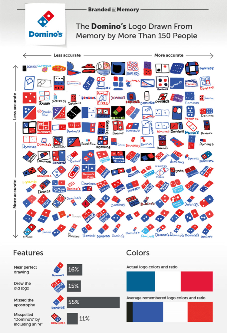
The pizza hut logo for Domino's made me laugh
cowpiefatty
Its good to know my drawing skills are up to par. Apparently.
GayCakesForHomophobicBulldog
Besides being nonsensical, the axis also aren't an actual progression within categories. Y tho.
PeteTusk
Pizza Hut?
8008135calculator
Difficult when companies have multiple logos. You cant really say they're wrong because they drew the other logo from the one you think of.
DrunkGermanGuy
Seriously, I think the trefoil logo for adidas is legit, especially since some people did a really good job drawing it.
Konargus
Make them draw windows logo.
PleasantPeasantPheasant
This person doesn't understand how percentages work...
j13jayther
There are overlaps, like old logo + no tail for the Starbucks one.
Umbreon07
You can always tell who the "fuck it"s were.
circlebreaker
Can we stop to acknowledge that some of them drew the logos from 25+ years ago though? I'd call it a victory for memory.
BMANN
I'm a fan of the guy who just drew pizza for Domino's. And a literal foot locker
coolbandana
I was waiting for Maccas
RedIronCrown
Domino's color ratio makes me think they're about to surrender to Pizza Hut.
OfficialSponsor
Too late apparently
McMasterx
Foot Locker*
shinydev
I don’t think the guy who remembered all four letters in IKEA should get the same credit as the guy who nailed the Starbucks logo.
sassybaskets
Why are there two axes??? Measuring the same thing (accuracy)?? Based on what??????;!!!!!!
ARandomAlien
one for how accurate and one for how well it was drawn I imagine
OnlyPositiveComments
Thank you for this.
McMasterx
The top is color, and the left is general shape. But that swaps itself a couple times.
istrandedjebediahonthemun
Then label the friggin fratchin flippity axes that way... - A frustrated data analyst
HylianFox
New Nintendo logo is easy, just change it from red to gray...
UltraLegoGamer
Some of these have MEME POTENTIAL. People, on it, now!
IHateApostrophes
It makes my eye twitch just a little bit to see two axes that are actually exactly the same.
CycloneSP
agreed. but upon closer inspection, it looks like the horizontal axis is about drawing skill and the vertical axis is about concept design
KoRplussomeletters
I think not getting the correct shade of blue is being a little pedantic.
anarkhiya
TIL Target is Poland, Domino's is France, and Foot Locker is the German Empire.
PracticalCactus
This comment deserves more credit
anarkhiya
vampirehedgehog
Ikea is Ukraine and Burger King is Romania.
clk62
and Starbucks is Algeria.
wanjo
The upper left corner of each chart gave me a lot of joy.
Theingredientstoacake
I didn't even notice the scale until you mentioned it! :) Thank you
GrandmaCantFightButYouShouldSeeHerBox
The upper left of Walmart, lol this must have been a participation grade in an elementary school
EliMFrost
+1 to the person who drew a yellow target for walmart
Misha49
And 2 Ls
HanktheHeliotropeShank
How about the guy who drew a petsmart bouncy ball on for wal-mart?
ErinFromTheOffice
For Wallmart actually
PuppyDontCare
I love the less accurate ones more than I care to admit.
Brant04
There's a Verizon logo in walmart
Kage197
Didn't even notice man, that is some good shit
Kalid19
I hope the smiley faces were counted. Since it *was* an old logo of theirs.
Dodilei
Someone drew a pizza on the Domino's one
bentwrenches
Someone also drew a Pizza Hut logo for Domino's
alexasami
And a shoe for Adidas haha
moricai
The guy above and to the left drew Adidas for Walmart.
CommentDiver
And from there go left 2 rows to find Donald Trump on the top for Walmart
greymaria
How do you go left between rows?
CommentDiver
Vertically of course
JetSetGo
I think he meant columns.
DanTheStanMan
This might just be a brilliant test of your logo's recognizability.
CycloneSP
walmart changes their logos too often. I still greatly prefer their older one before they had an asterisk
McMasterx
Wal•Mart*™
westwood8183
3 times in like, 35+ years is too often for you?
CycloneSP
yup
ringringringringringbananaphone
The Target ones where more or less spot on!
CycloneSP
there's something to be said about a simple, memorable logo that doesn't change much
lazysombrero
I see what you did there
ImAfraidYoureAllPsychosSoIMadeThisAccount
Kalid19
the ones without the words should be counted the same. annoys me
HanktheHeliotropeShank
I like the one that's a 'T' is cross-hairs. Like dude, have you ever been to target?
Spearka
they were on target
moricai
PascalCasedUserName
I can't help but think some people remembered the logo exactly but can't draw for shit.
TheBlackVan
*raises hand slowly*
itsybitsyspider
I definitely got that feeling.
whatsisname
A lot of people say that drawing is not a mechanical skill but a matter of being able to clearly see in your mind, and if they're right,
meerple
The most important skill in drawing is seeing how things actually look, instead of seeing a "symbol" of the thing.
whatsisname
the people that can't draw for shit also don't remember the logo exactly.
iSoulend
I'm not saying you're wrong, but reproducing a simple drawing when you have it in front of you still doesn't make you good at it
PascalCasedUserName
Then I guess they're not right, because I can't draw a lot of stuff that I can visualize quite clearly.
Aerolfoz
And I know I can visualize it,because if given options or some other failsafe way to do stuff,I have zero problems with it. Only the drawing
27yoUGLYvirgin
That's an interesting question. I first downvoted you but now I'm not sure anymore. I'm going to stay neutral. Would love to know that.
ROBOTvsMAN
Best one:
scopegoat
lol nobody noticed it was you
norill
notice how close it is to the accurate corner
HylianFox
actually looks a lot like the original logo
Abracanawbra
I did the ol'wtf'n scrolled
HotCrossNuns
I can fap to this
blueknot
As often as they change, I think they should give a little more credit to accurate versions of old logos. The rainbow apple goes way back.
geiokami
Also the light blue apple logo from the early 2000s
NapAllDayPartyNever
to my childhood years of where did carmen sandiego go this time? usa? world?
thegriffin88
Plus I liked it better.
somethingsomethingmcbob
Me too!
SarahTheCuteVixen
I kind of agree with you there
PresidentBolbi
https://imgur.com/G5VaPG7
KevinBhall
absolutely!
DontAskMeAboutMyUsernameOkay
Yeah dominos changed their logo recently as well.
WillJeSuis
I don't get why the 3rd one on the top isn't at the very start. It's a halfmoon on a grey background. A moon for christ sake.
blueknot
the two to the left of it don't have anything that could be considered a 'bite'
WillJeSuis
At least they were apple shape. The 3rd is more moon than apple.
ImguriansFillMySaltReservoir
I'm pretty sure the 1st one is the forever alone face. And the second one is is blue skeleton pelvis. At least the 3rd one had the colors
icelandicsealbear
Yea this is basically "gave crappy directions"
StupidEcho
Isn’t the second logo for Apple Records which current Apple took its name from?
blueknot
Close; Apple Corps logo is a full granny smith; Beatles did use the sliced version as label art on the white album.
blueknot
https://i.pinimg.com/736x/d2/ef/55/d2ef5551acc374fb83b15f1644df8a1f--the-beatles-white-album-the-white-album.jpg
Lulabel73
Abbey road as well
StupidEcho
Cool facts to know, thank you!
BlindDivine
i was thinking about that. the people who drew rainbow apples must be older than the rest
dagg3r
Are are they the original hipsters?
blueknot
Lil' further back than that... https://en.wikipedia.org/wiki/Hipster_(1940s_subculture)
TheBlackVan
Back when Apple was the Product and Macintosh was the brand. I was born in 91 and I remember those days.
blueknot
No, I remember them too; and the Macintosh was the product; Apple the company existed before that (the ][e etc.)
thegourdkingpumpkin
hate to break it to you but mac was always the product bud
InvadingYourSpaces
The rainbow logo was the trademark of the Macintosh line.
viila
judgejudysbooty
Way back to the last time I bought an apple product
bobtheaxolotl
Me too! Although it was just a few months ago. Apple IIc.
toddthewee
//e Represent!
governmentgavemeagun
There are dozens of us!
SeriouslyAwkward
Back when their model was do more for less hahaha....HAHAHAHAHAHA
TK421isAFK
*motto
SeriouslyAwkward
Model is correct as well.
TK421isAFK
Not phrased like that. It was one of their ad lines, just after the Apple name was brought back to the forefront of Macintosh, IIRC.
THRAWN18
Lol you bought an Apple product? *Sent from my Windows Phone
valen00
Apple IIe was the bomb
CosmicSentry
They're not bad phones. Before this android I had a few of them and they all worked faultlessly as work phones.
TheBlackVan
iMac computers run our office. My laptop is Windows and my smartphone is Android. ZERO FUCKING COMPARABILITY!
THRAWN18
I have a Lenovo for my office and I fucking hate it. I work in banking and this POS can't run Excel properly. Let that sink in.
SeriouslyAwkward
If your desktop is as new as you say it is. It should have no problems running it. Running it well is managed by software. So blame your
LordPhil
Don't blame a brand for hardware limitations. Blame whoever made the purchase
WookieJebus
I also have a Lenovo. I'm a Software Engineer. This thing outruns some desktops. Maybe yours is just old as dirt?