malumfortis
415
20
21

Missouri. I simplified the state seal.

Washington. I pulled colors from the Washington state tartan.

New Jersey. I played colors from the seal, they symbolize the silt and sea.

Indiana. My home state. Out of nostalgia, I didn't change anything but eliminate the text. In hindsight I could have also removed the lines coming from the torch.
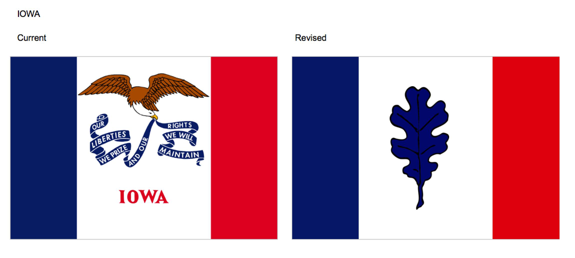
Iowa. The middle is too messy. The state tree is the oak, so I pulled the leaf and used it.

Oklahoma. I enjoyed the symbolism, so for this one I just removed the text.

Massachusetts. Flipped colors, turned the star into a stylized mayflower.

Louisiana. I pulled the colors, flipped them around a bit and used the fleur-de-lis.

North Carolina. I pulled the gold out and the star down.

West Virginia. Stylized WV to kind of look like the mountains.

Maine. I pulled the light blue and red from the banners and kept the star.

Michigan. Sorry, this is a mess. The original - not mine. The blue for the lakes, the green for the trees, and the yellow for the golden dunes.

Utah. The Deseret State. Deseret means honeybee in the Book of Mormon.

Pennsylvania. The keystone for the Keystone State.

North Dakota. Kept the colors and the star from the original.

Nevada. Kept the colors and the star from the original.

Virginia. Took the blue and white from the seal and the flag, and the light blue symbolizes the ocean.

New York. I made the colored stripes the colors of the 2 women and a white band in the middle for balance and to go off the banner below the seal.

Nebraska. It was hard to come up with something for this. Sorry.

Montana. Stylized seal on the blue background.

Kansas. Took the symbolism of the sunflower and made it more of a sun.

South Dakota. Got rid of all the text. Flipped the seal around a bit.

Minnesota. Somewhat of a "stretched out" seal. Gets rid of all the noise and keeps the symbolism of the stars.

Kentucky. I took the colors surrounding the seal. Not much to this one, unfortunately.

Wisconsin. The light blue wedges symbolize Lake Michigan and Lake Superior.

New Hampshire. Sea and sky - similar to in the seal. The 9 sided star is reminiscent of the sun in the seal and has 9 points - New Hampshire was the 9th state admitted to the union.

Oregon. This flag is unique since it has a different obverse. I kept the beaver and stylized the front with a rustic looking "O."

Vermont. I took the Green Mountain Boys flag and realigned the stars for a simpler design.

Arkansas. The new flag removes the text and the top star was removed since the blue star above "ARKANSAS" represents the Confederate States of America

California. This is an iconic flag loved by many, but no flags should have text.

Connecticut. This one was tricky. Simplified the Baroque shield and grapevines. The stars bring over the yellow to the new design and show that CT was the 5th state.

Delaware. The Diamond State gets a makeover with removal of the seal and the date.

Florida. The seal needs to go, but then the flag woudl be identical to Alabama's flag. The blue signifies the ocean.

Idaho. Seals are too busy on a flag. The new design adapts some color form the old flag and used the ID of the state name stylized to the shape of the state.

Illiinois. The current flag is too busy and has text. The updated version is a simplified version of the Illinois Centennial flag that was designed by Wallace Rice, designer of the Chicago flag.
vodkaho
Most of your designs are complete crap.
OhLurkOverThere
The first time someone told me Oregon's flag was 2 sided, I jokingly replied, what's on the other side, a beaver? Was surprised I was right.
DavidGage
Your updated flags would all have made very nice basketball jerseys in the 70's.
whothehellareyouanyway
no
mastercheif
concur
Facts2triggerU
You made good flags terrible. You should feel terrible.
malumfortis
Well, I don't.
CwmMakesPeopleCryInScrabble
The CA bear looks like a wild pig.
malumfortis
Yeah, I'm not a designer and used a word processor to do these. Sorry :(
Igpayatinlay
Yes. The NJ flag is awful and yours is much better.
malumfortis
Thanks!
raycervan
Op's a flaggot!!!!!
malumfortis
I concur.
bumguts
He didn't touch my flag. Mine is the best.
malumfortis
Probably because yours is one the North American Vexillological Association doesn't rate as low. Congrats!
Alvatore
These are great if you want to design corporate logos, but the original state flags are far better. It's like you don't even understand 1/2
malumfortis
The top rated flags by the North American Vexillological Association society do not have seals or text.
Alvatore
Alvatore
why the flags have seals or why the seals are what they are. Maybe try learning more about what you're working with first. 2/2
malumfortis
Maybe try learning more about what you're commenting on first.
Einsamax
Nah many are shit, flags really shouldn't be busy or have words on them.And sticking the seal on there is just lazy.